コーヒーとひと口お菓子は、最高の組み合わせです。コーヒーのためのお菓子なのか、お菓子のためのコーヒーなのか。コーヒーもお菓子も好きな私にとって、もはや主従関係ははっきりしません。
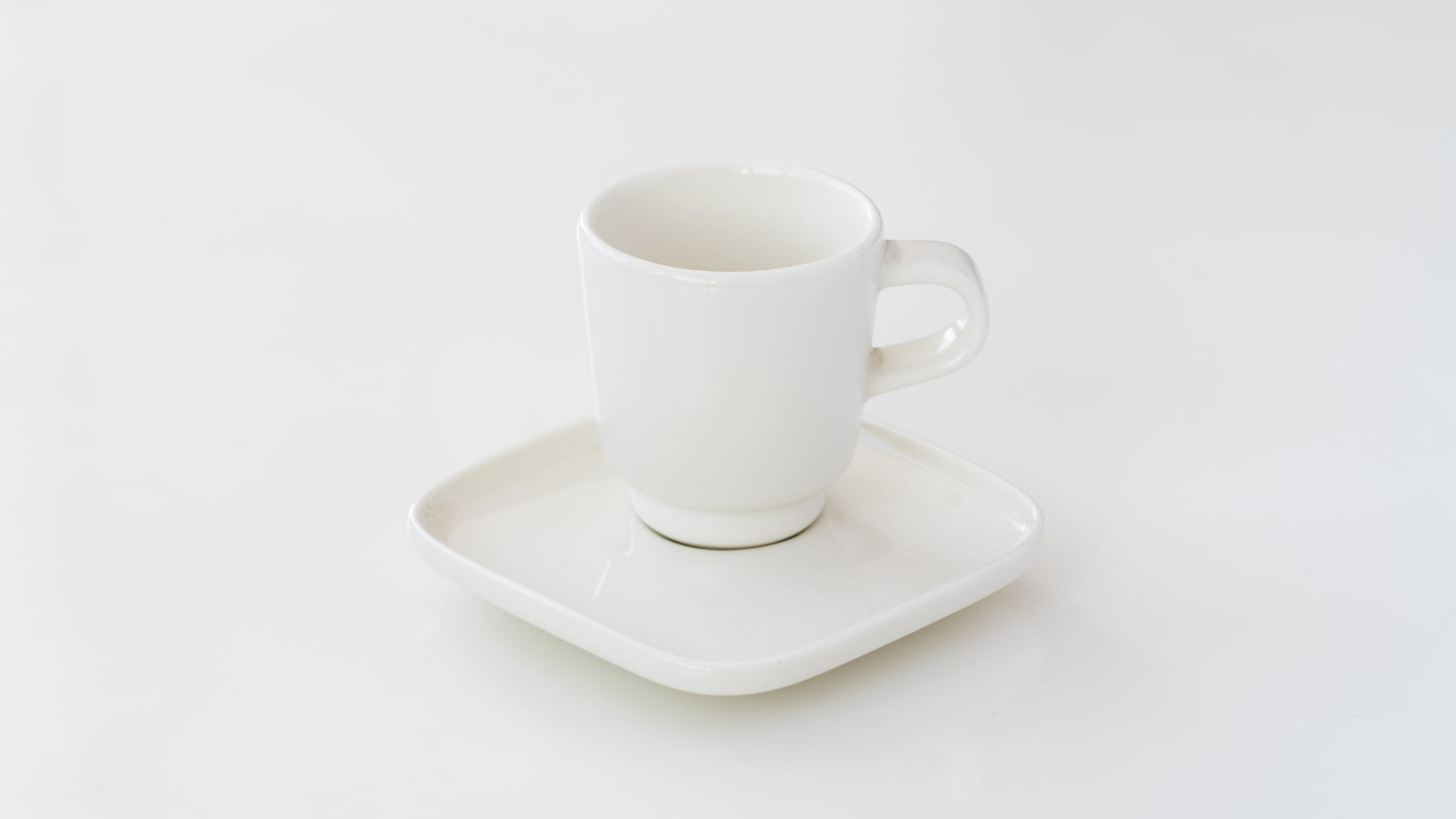
 minä perhonen, beadsカップ&ソーサーfor DO ※写真のチョコは、浅草ケーキハウス タカラヤのオレンジチョコレート
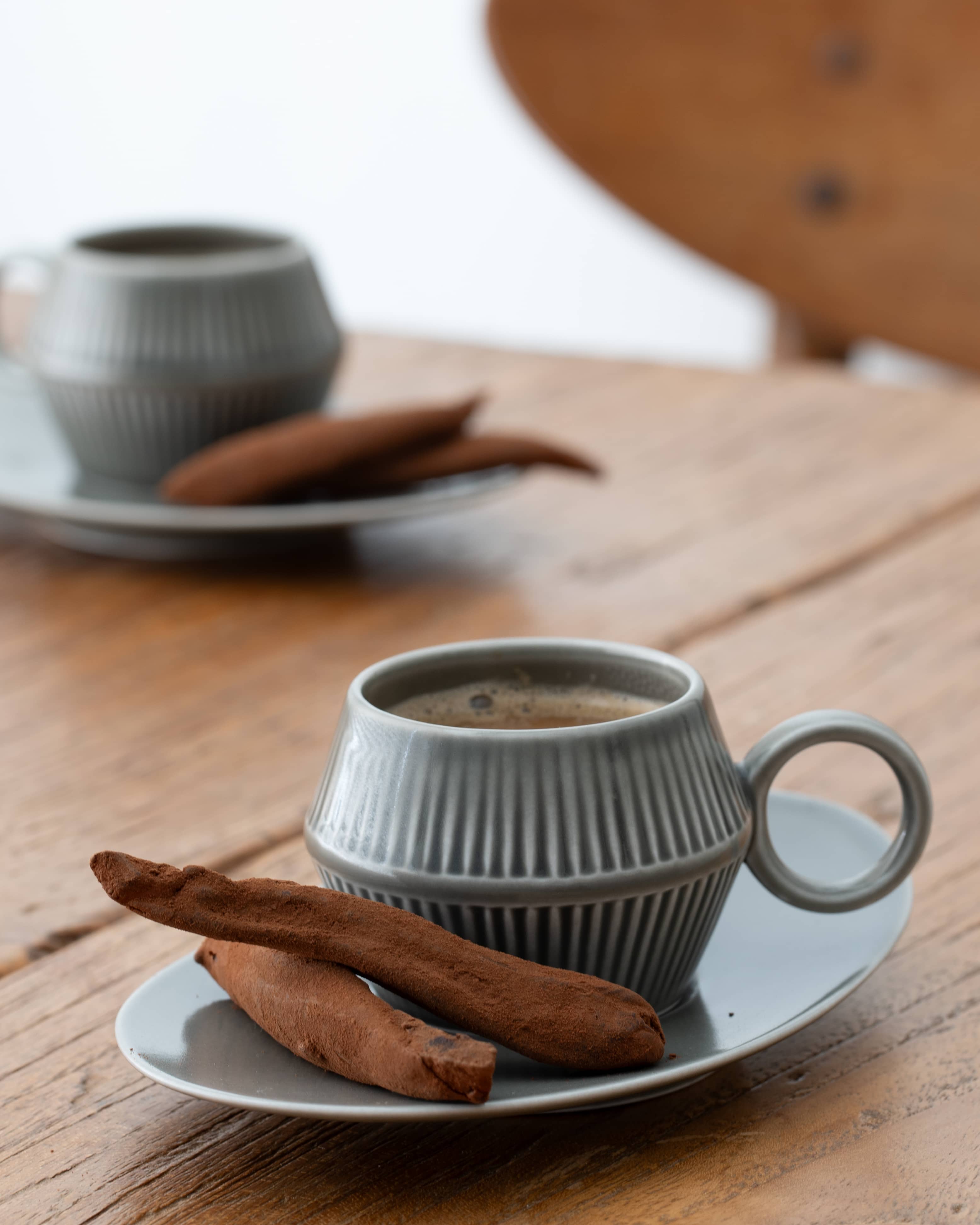
このカップ&ソーサーをはじめて見かけたとき、もちろんデザインにも惹かれたのですが、同時に心でひそかに思ったのは、“ソーサーにお菓子が載る!”ということ。どうみてもお菓子のためのソーサーにしか見えませんでした。
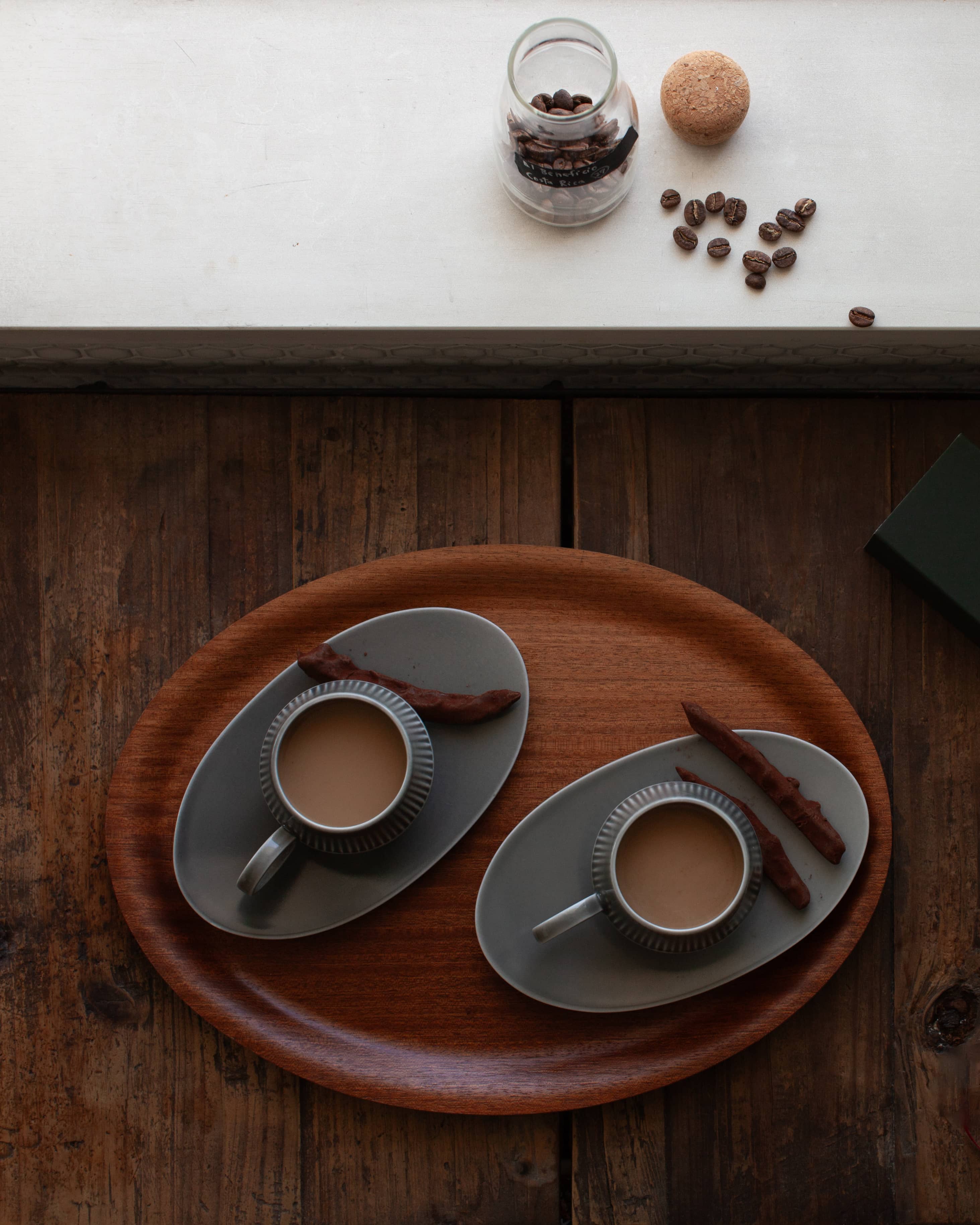 以前のエッセイでもご紹介した「浅草 ケーキハウスタカラヤのオレンジチョコ」
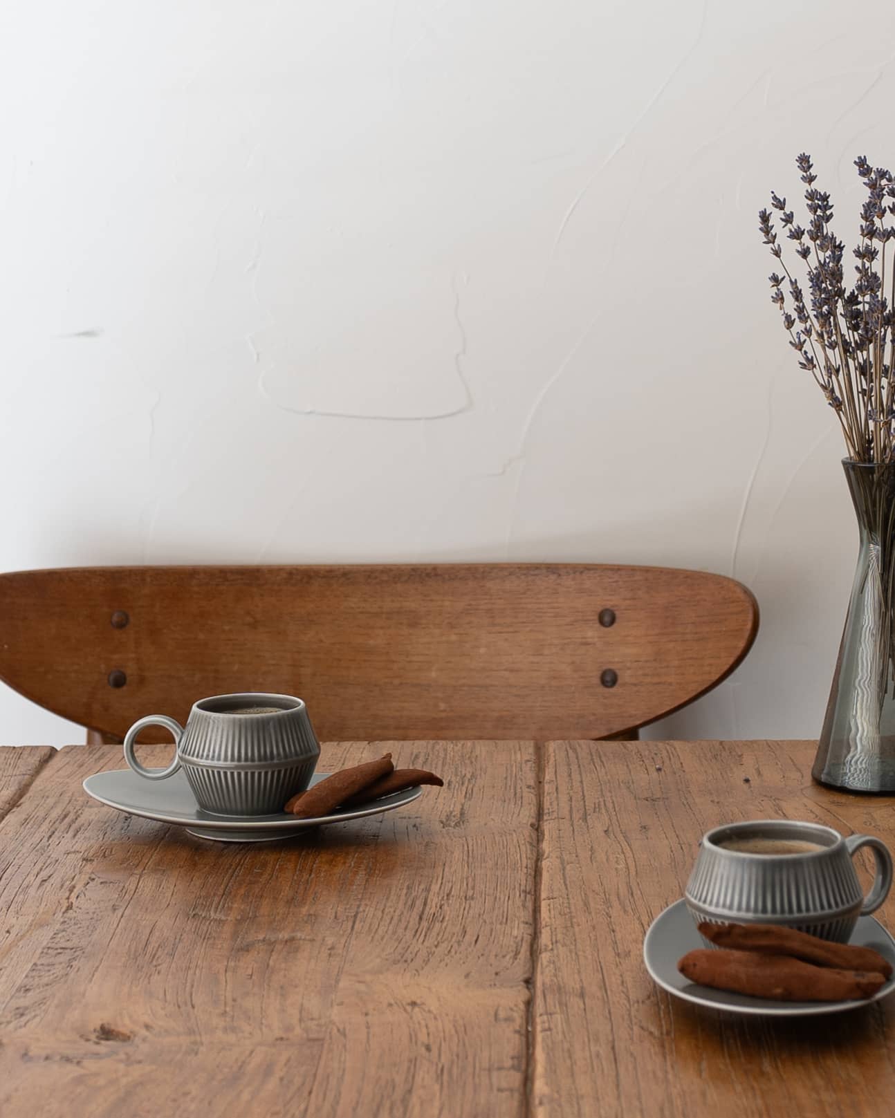
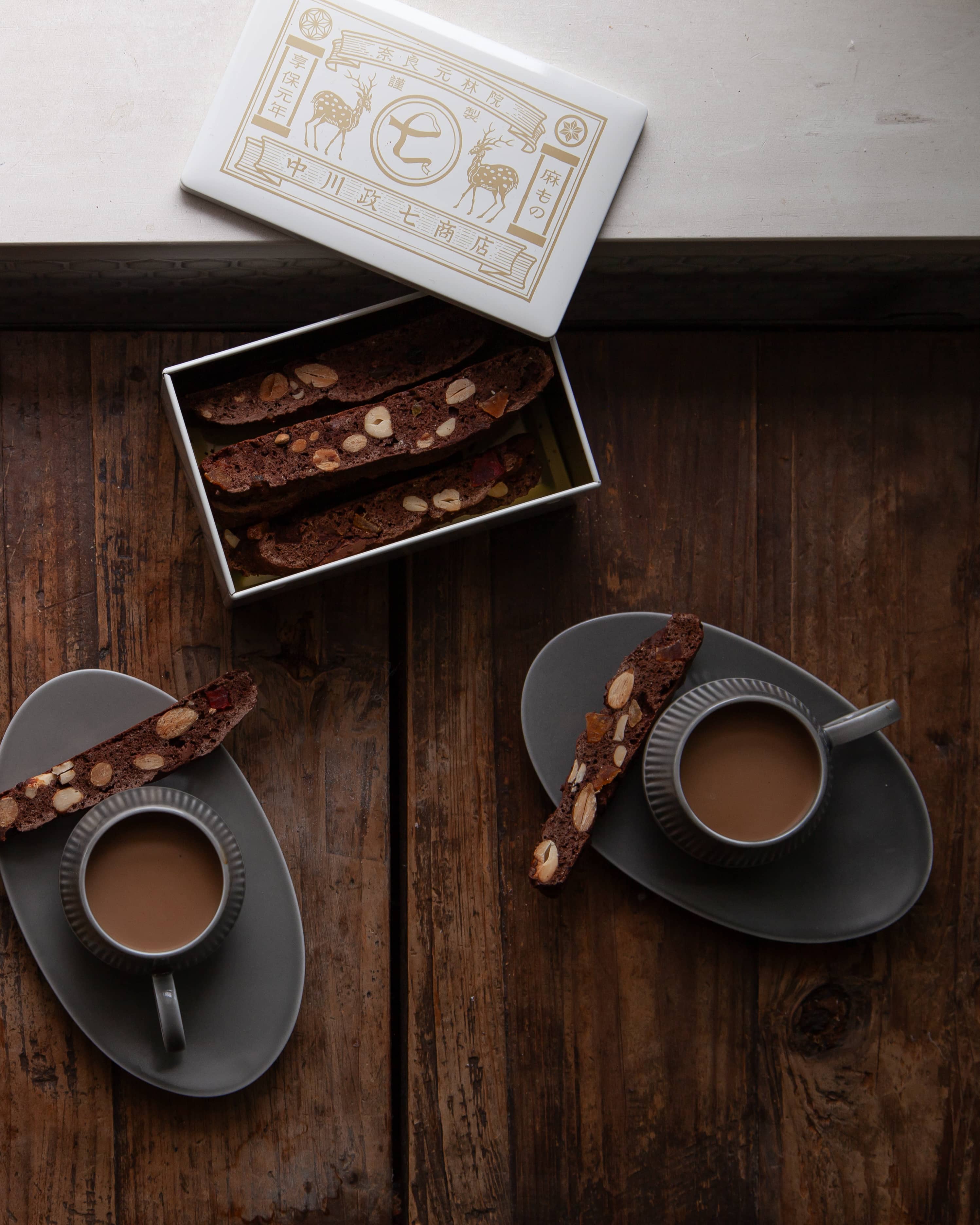 ナッツいっぱいの手作りビスコッティ、缶は中川政七商店のモノ
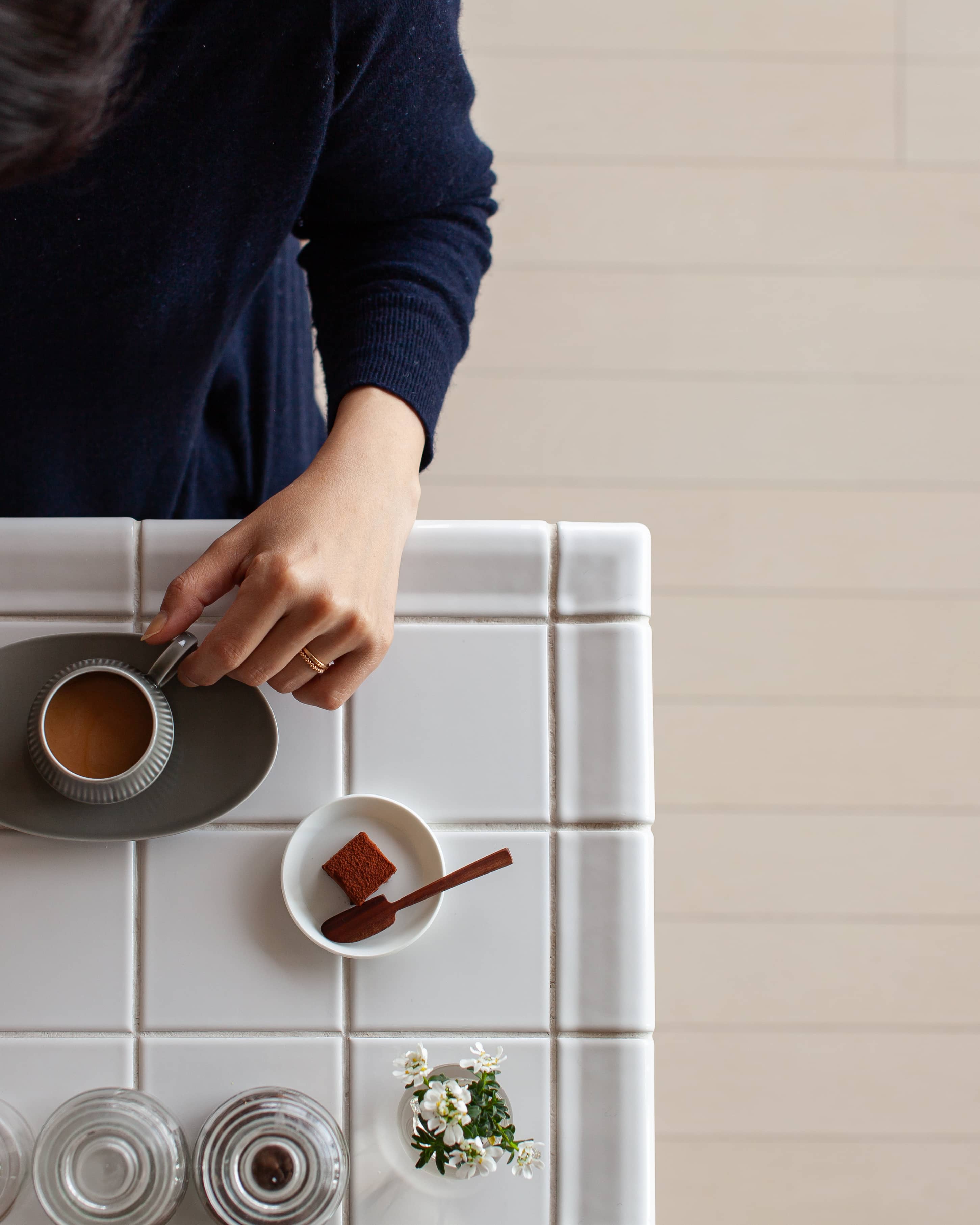 ソーサーには載せていませんが、手作りの豆腐生チョコと一緒に
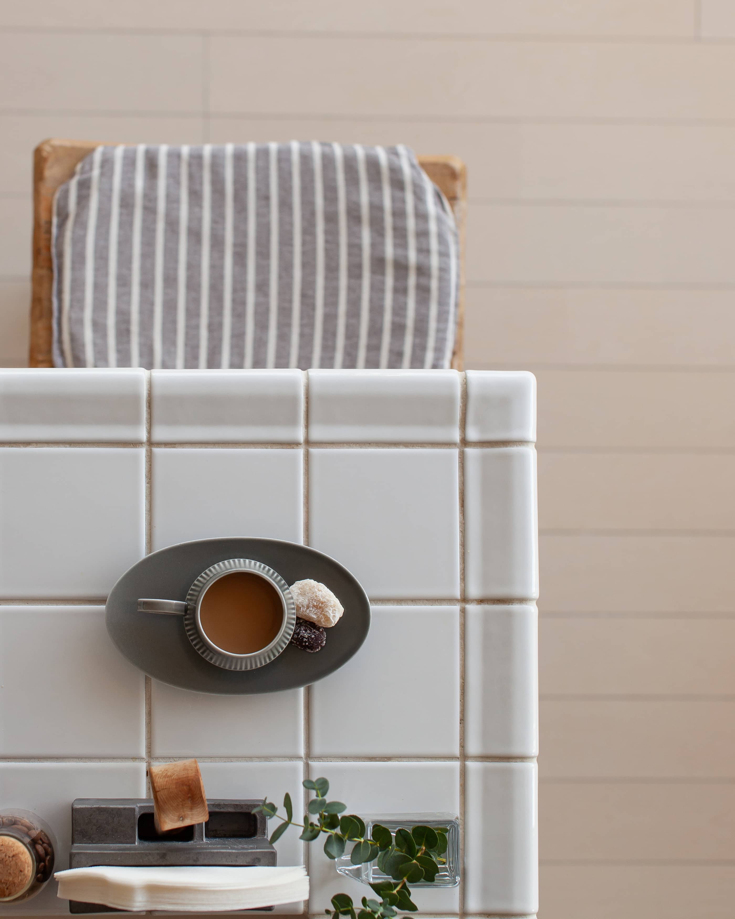 甘納豆をそえて。和菓子もコーヒーに合います
 博多 豆香洞コーヒーの珈琲羊羹。コクのある羊羹を考え、このときはほうじ茶とあわせていただきました
過去8年分の写真を振り返ると、お菓子が写っているものばかり。中には一口では食べられないほど、大きなお菓子もありました。
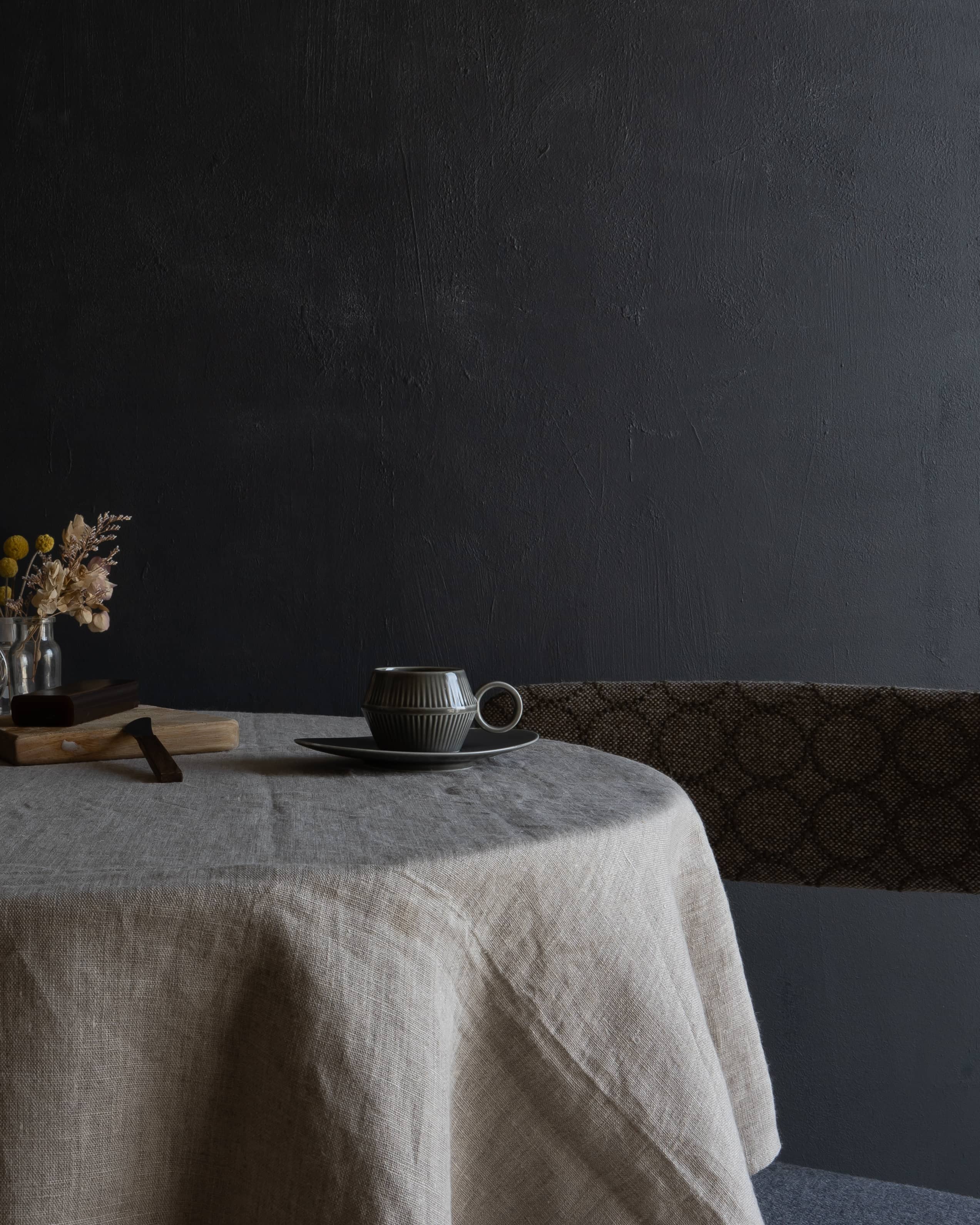
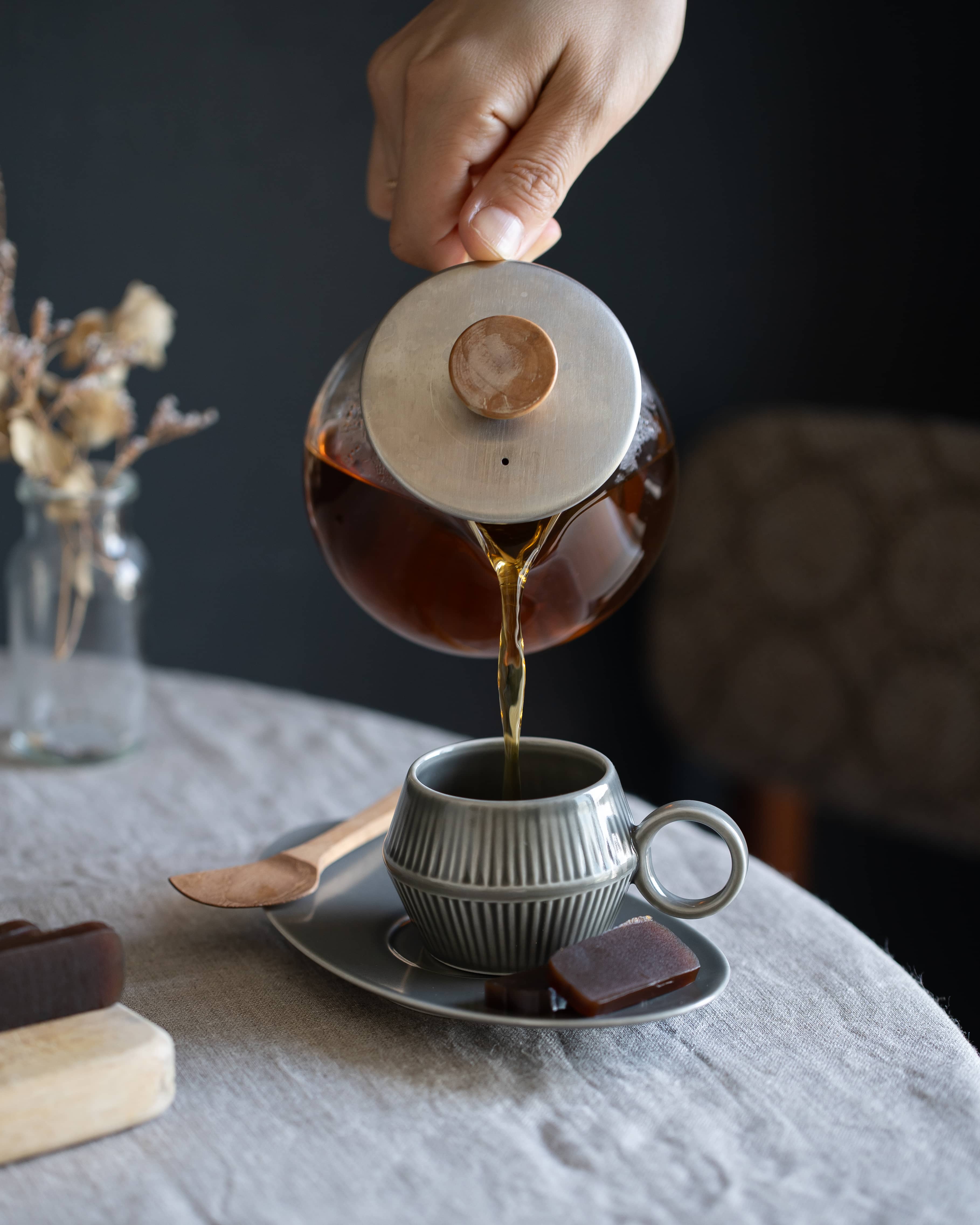
お菓子をはなれて、器について。minä perhonen 皆川明さんデザインによる、このカップ&ソーサーの魅力は、なんといってもグレーの色合いにあります。グリーングレーのかすれた色味が、どこかレトロで洗練された印象を与えてくれます。
 グレーは、CLASKA Gallery & Shop "DO" のためのオリジナルカラー。表面のツヤをつくる釉薬は、ひとつひとつ施されるため、色ムラが必ずありますが、それがかえってふたつと無い味わいをもたらしています
- 磁器(長崎県 波佐見焼)
- カップ直径5×高さ5cm 100ml ソーサー幅16.5×奥行き10cm
- 電子レンジ ○ 食器洗浄機 ○ オーブン ×
普段遣いには、少し特別感のあるカップ&ソーサーですが、“これは”、というひと口お菓子を見つけたときは、この器で頂くことをいつも楽しみにしています。