部屋にアートを飾るとき、いつも心に留めておく、あることがあります。それは、「アートはインテリアの最後の仕上げ」ということ。新居に越したり、リフォームしたり、あるいは部屋の模様替えをするときも同じで、お気に入りの空間に仕上がってきたら、最後の筆入れのような感覚でアートをチョイスします。まさに画竜点睛(がりょうてんせい)、大切な「仕上げの一筆」のようなイメージなんです。
今回ご紹介するのは、かつて入居していたアトリエと、そこに飾っていたナイジェル・ピークのアートのお話です。
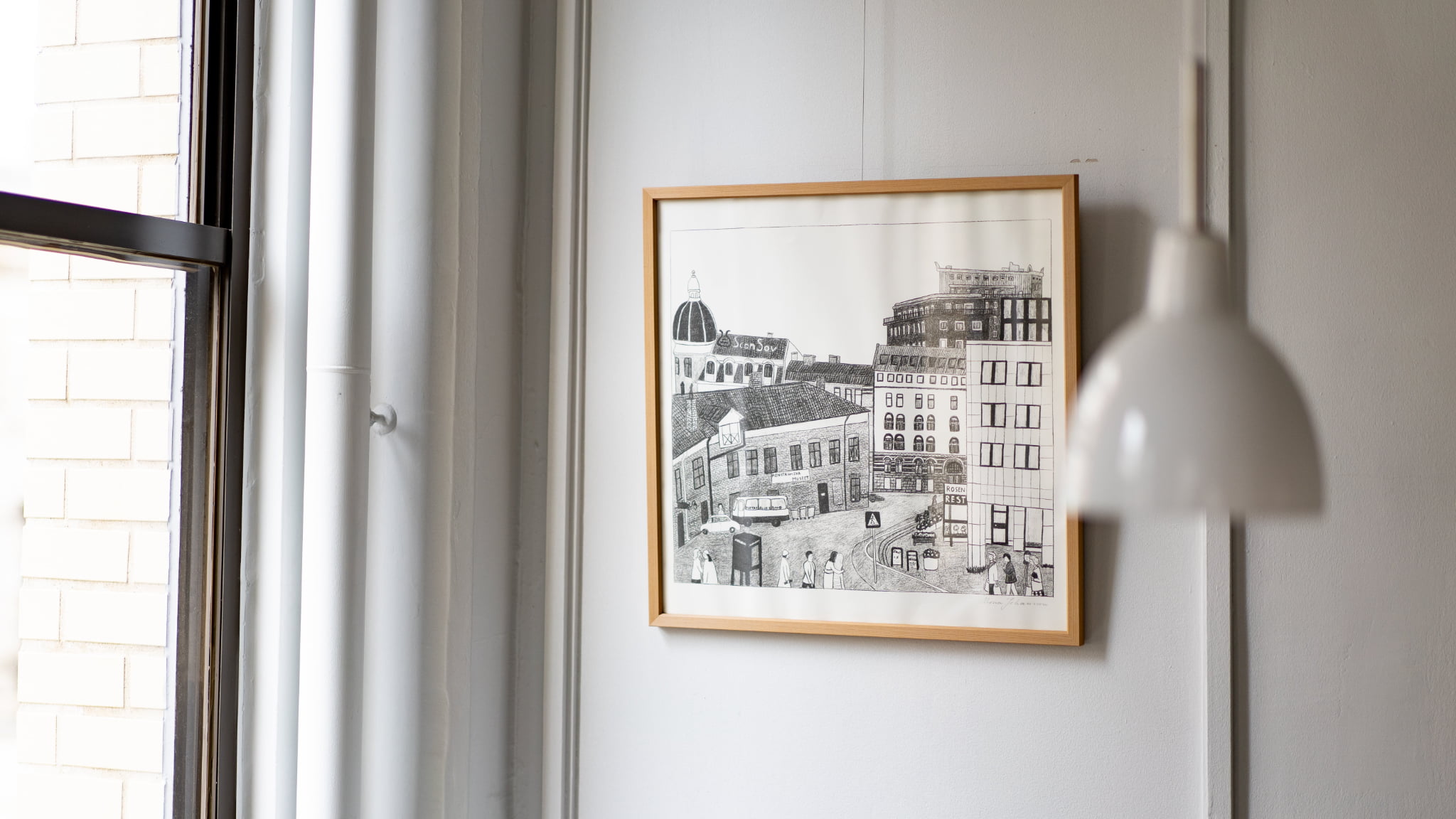
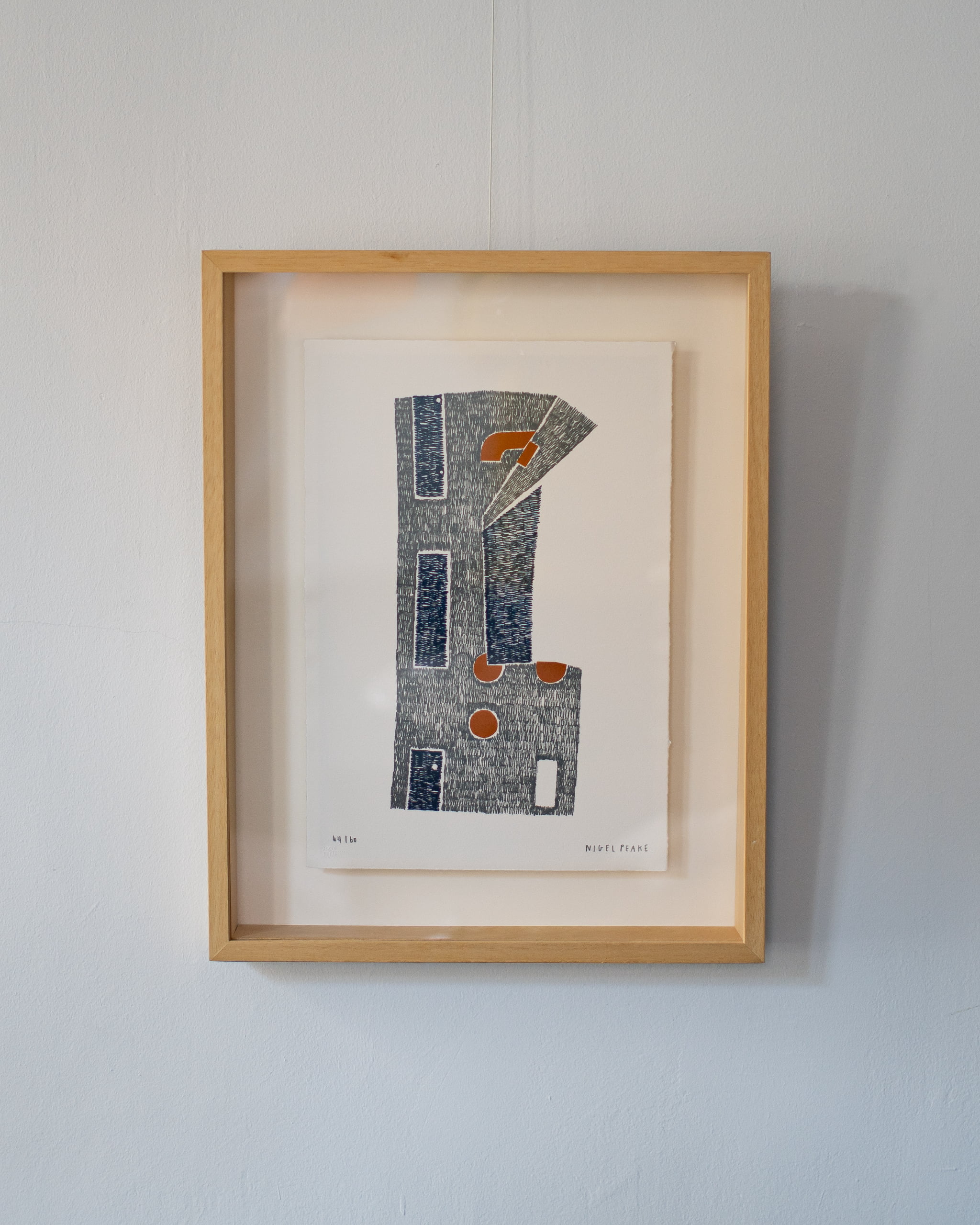 ナイジェル・ピークがパリの地下鉄の回数券からインスピレーションを得て制作された「TICKET」
ナイジェル・ピーク
アイルランド出身。建築家とアーティストを兼ね、建築や都市、風景をテーマにした詳細な描画で知られています。
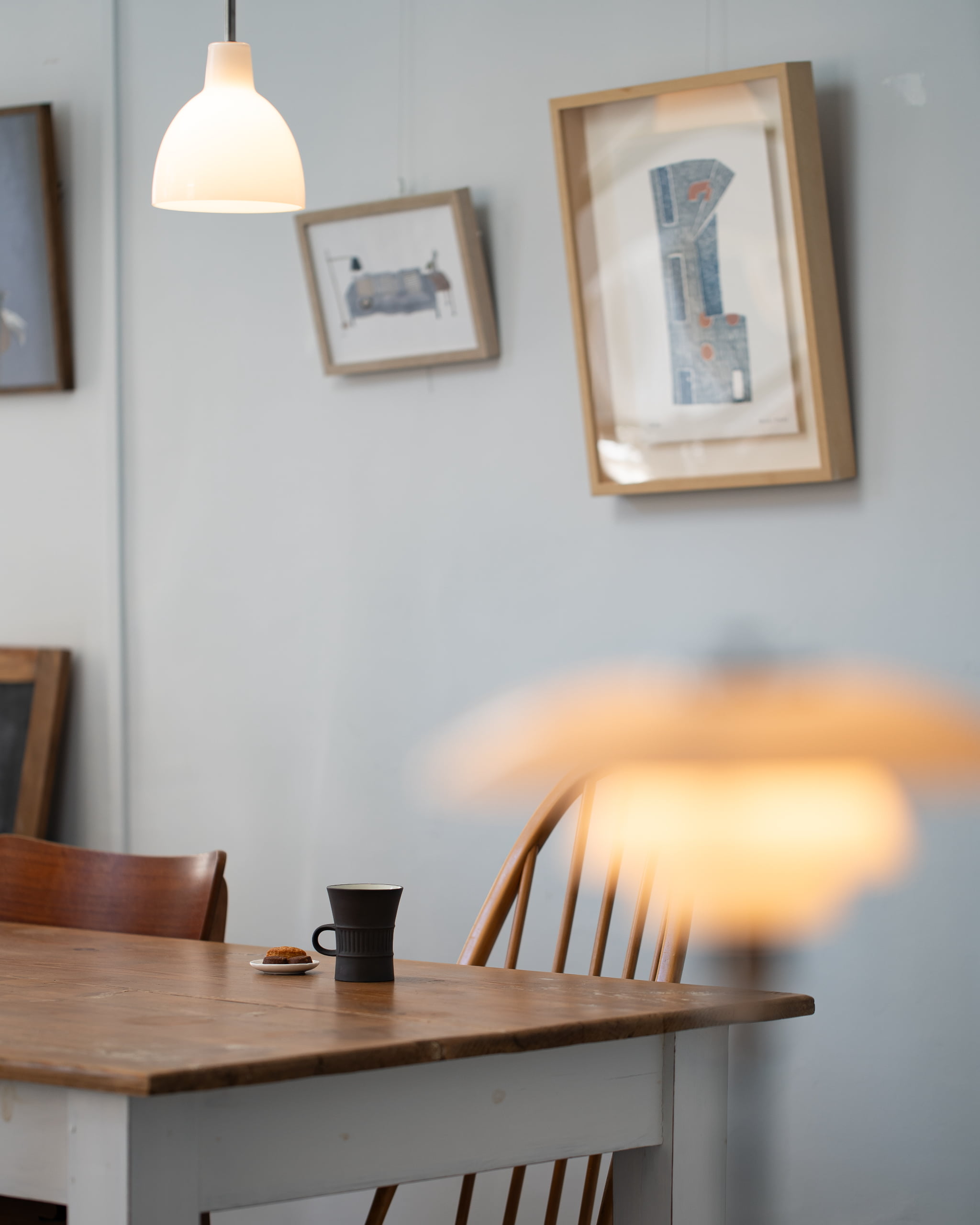
この作品を、かつて入居していたアトリエに飾っていたことがありました。そこは築80年を超える歴史的建築物。室内もビンテージ感あふれる雰囲気で、建物と作品がよく馴染んでいたことを覚えています。
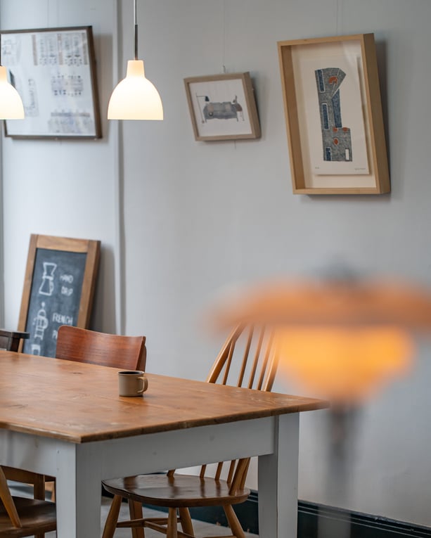 アトリエの室内の様子。写真右上の作品がナイジェル・ピークの「TICKET」。薄くかすれた色合いが、アトリエに溶け込むような繊細な雰囲気を出していました。
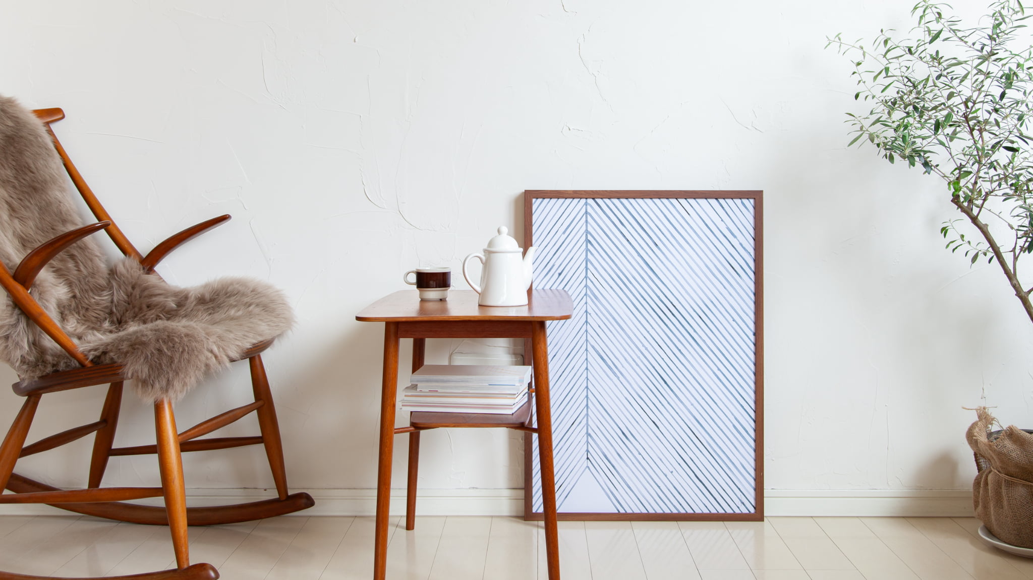
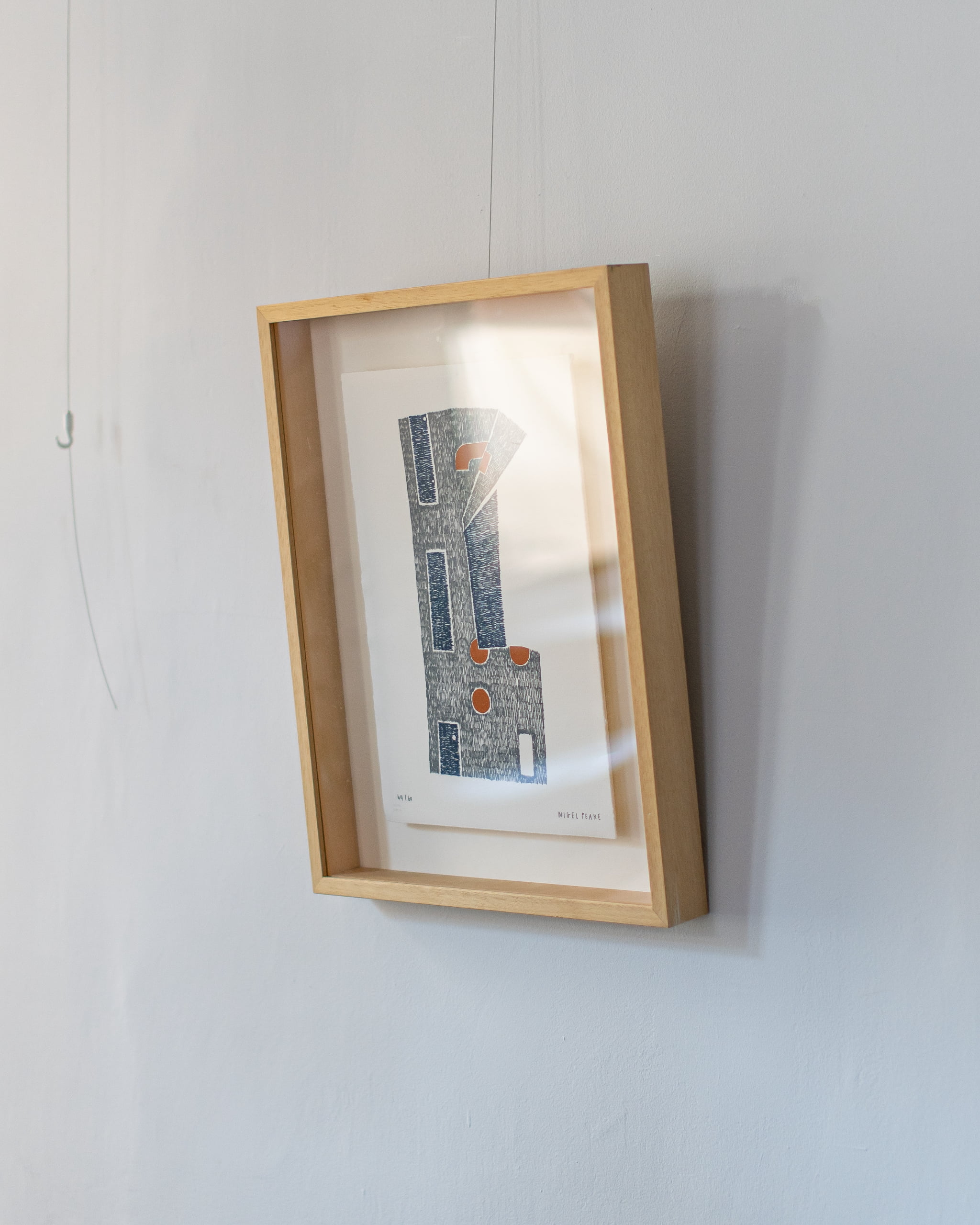 厚みのある額縁(高さ5cm)に収められ、背面から浮かせて展示されるスタイル。作品自体が浮き出るように見え、立体感のある特別な雰囲気をもたらしてくれます。
冒頭にもお話したように、アートを決める段階では、すでに部屋のイメージは出来上がっています。セレクトした家具の色合いや配置、アートを飾る壁のスペースなどが頭の中にすっぽりと入り、目をつぶっても部屋の様子が隅々までイメージできるような状態です。
ここで飾るアートを決めていくのですが、おおまかに二通りの考え方が、私(弓庭)の中にはあります。
部屋に馴染ませるケース
家具や床壁の色合い、あるいは素材の雰囲気に馴染むようなテイストのアートを選ぶことがあります。全体の統一感を優先するときで、今回のアトリエとナイジェル・ピークの「TICKET」が、これにあたります。
部屋のアクセントにするケース
インテリアの雰囲気にあえて馴染ませず、アクセントになるようなアートを選ぶとき。このアトリエであれば、遊び心があったり、少し原色に近い色合いのものを選ぶようなイメージです。
自宅に限らずインテリアの設えのお仕事でも、そのときどきのシチュエーションや部屋の在り方によって、引き算にするか、足し算にするか、ほどよいバランスをつねに考えるようにしています。