Once, a style known as Flatlay became trendy on Instagram. It involved arranging items like food or cosmetics on a flat surface and capturing them from above. We had been taking overhead photos routinely even before this trend caught on, garnering attention from international media, resulting in several articles, including one from a Vietnamese outlet.
When focusing on overhead shots, we particularly paid attention to "negative space," which sparks the imagination. This time, we're excited to share ideas on table coordination using this concept of negative space.
 A bird's-eye view of our dining table at home.
Utilizing Window Light
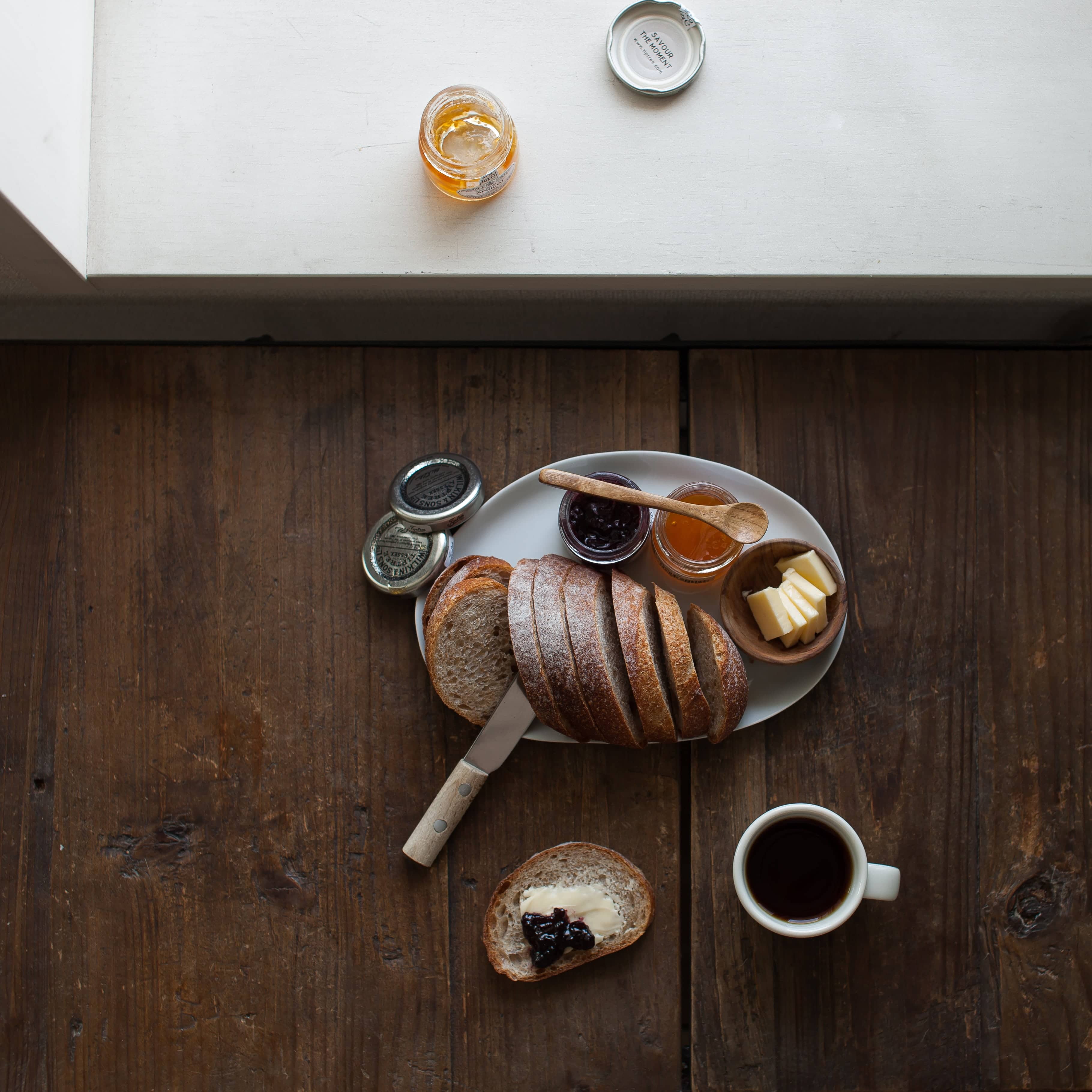
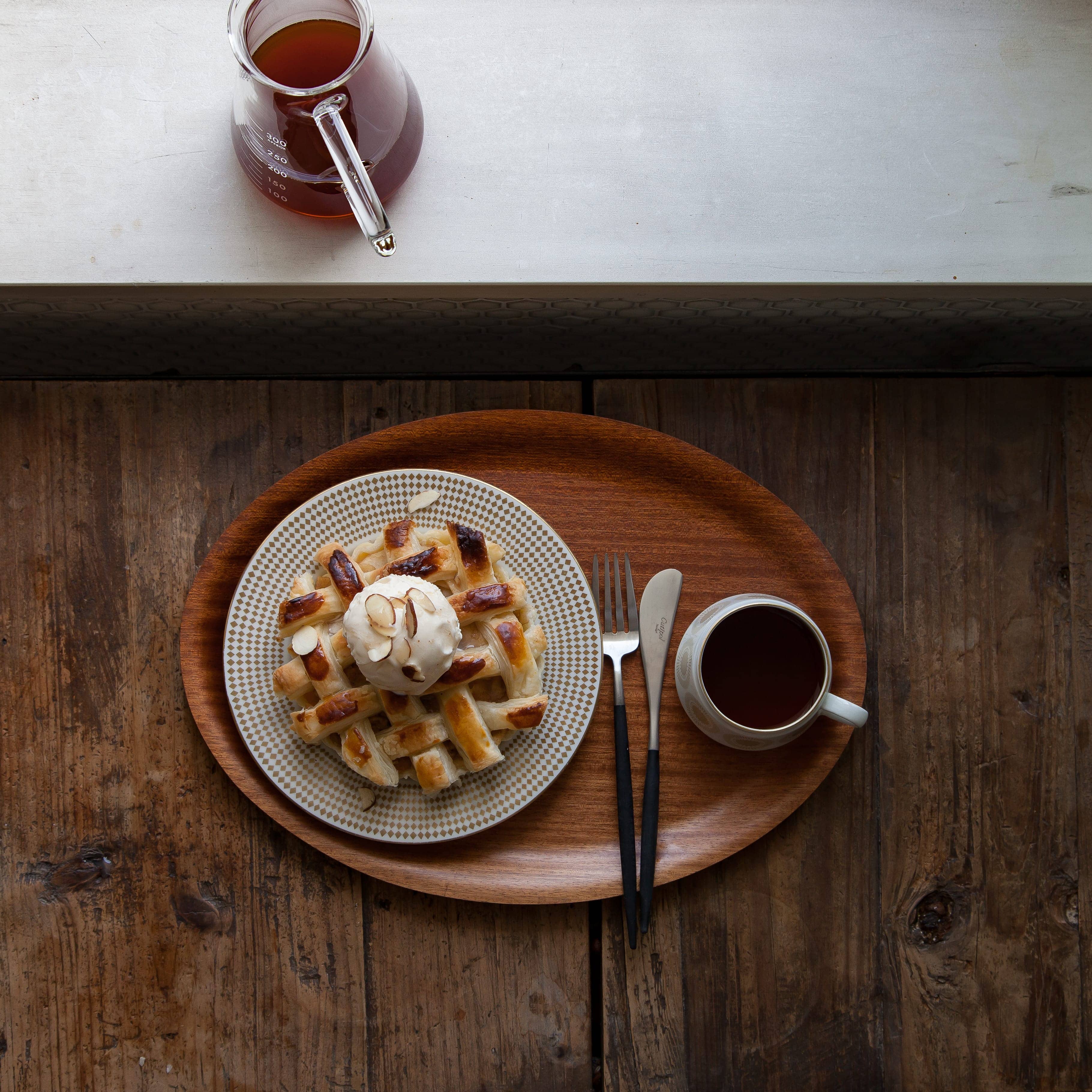
Here’s a photo of bread accompanied by jam and butter. I've pulled the lens back to use the space by the window as negative space. Although the window isn't directly visible, the white space and soft light subtly convey the presence of sunlight filtering in from outside. Window sills are perfect for creating effective negative space.
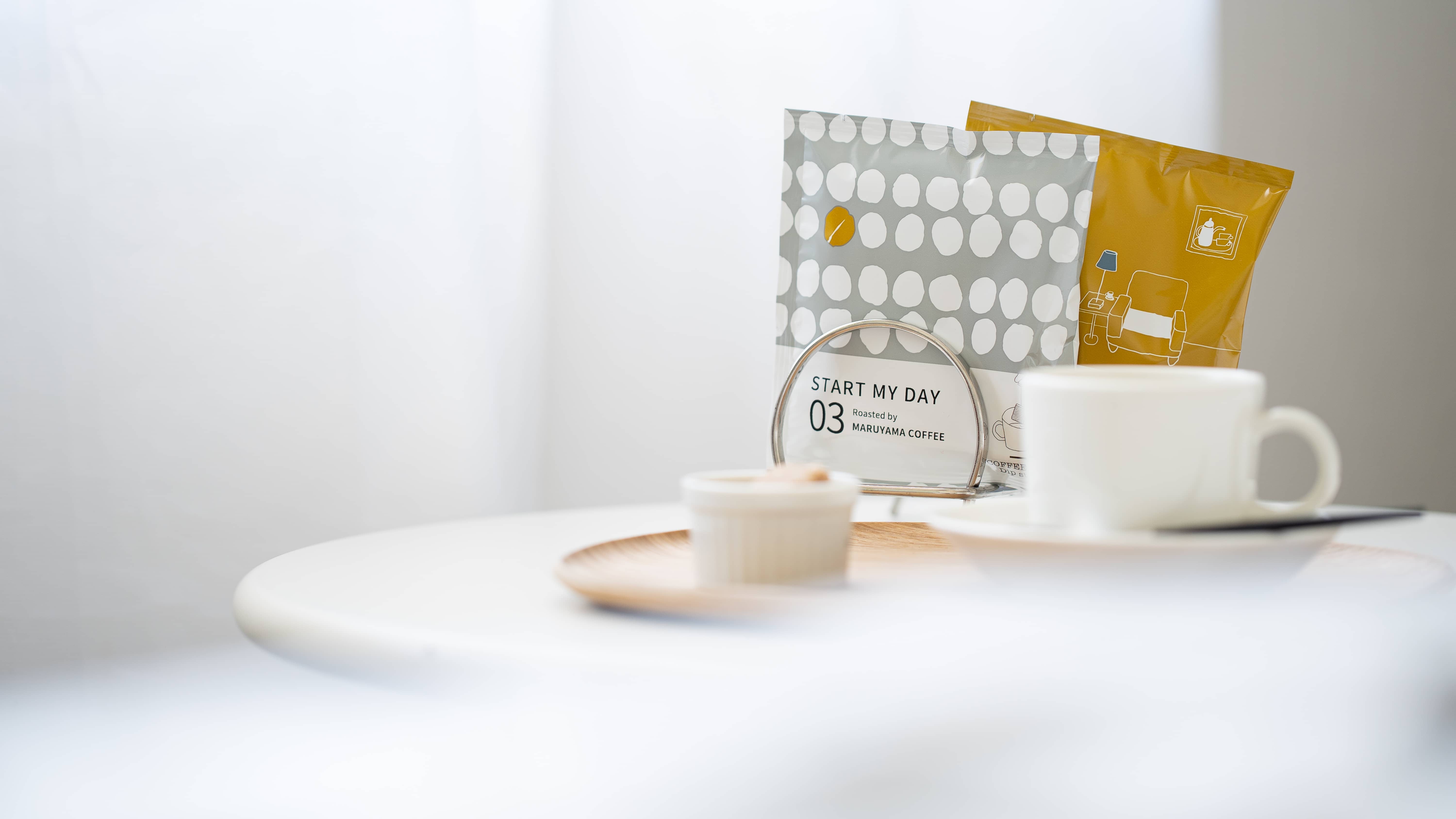
 A worktable near the kitchen window, where I often prepare coffee and snacks.
This photo could have been more appetizing had I zoomed in closer to the bread and coffee. However, including the window area shifts it from a mere "food photo" to one that suggests a "landscape," with the scene itself inviting varied imaginations.
Let’s explore another photo. Here, a vase of dried flowers sits by the window, chosen for their subtle hues to highlight the main subject, the jam toast.
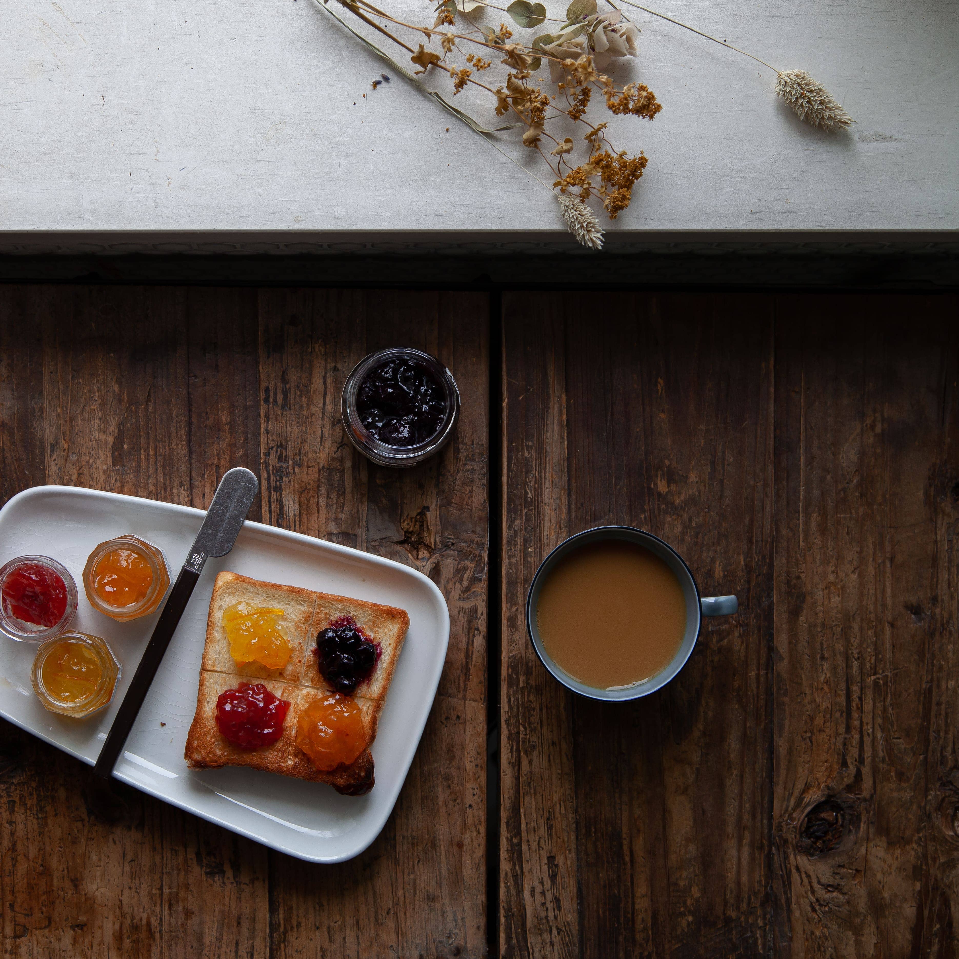 A colorful array of jams topping a piece of toast.
The patterns on the dishes shine best from an overhead angle. Our love for vintage dishes might stem from our fascination with capturing these designs.
 An Arabia’s vintage plate, Rio, with its elegant gold pattern, looks stunning from above.
Letting White Space Abound
A cluttered table full of dishes can seem busy. While it may create a lively dining scene, we opt for a different approach using negative space. Here’s an example.
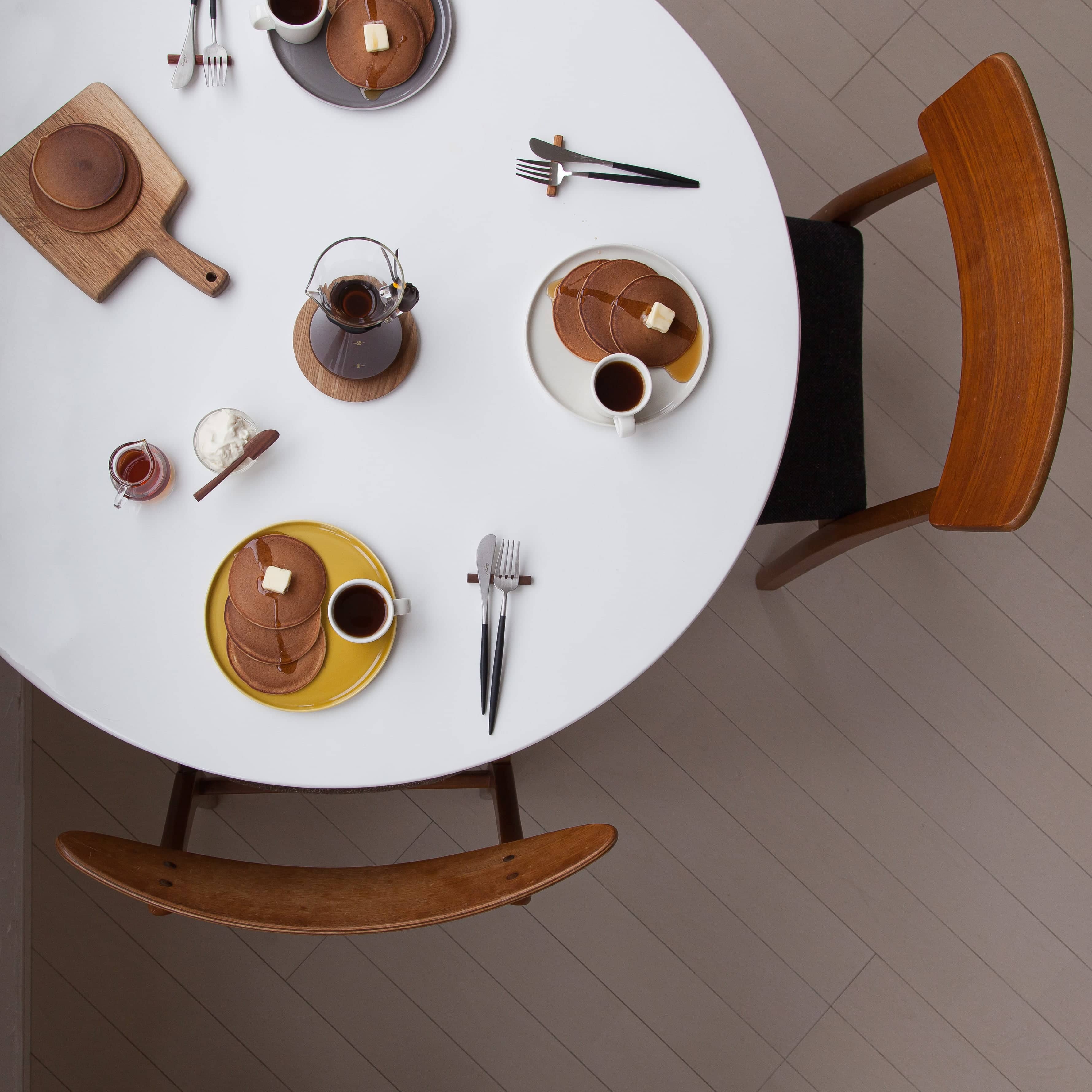
The above photo shows our dining table. It's a simple, minimalistic composition, literally letting white space abound. Some might find it sparse, preferring a busier table, but the presence of negative space actually enhances and highlights elements like toast and coffee.
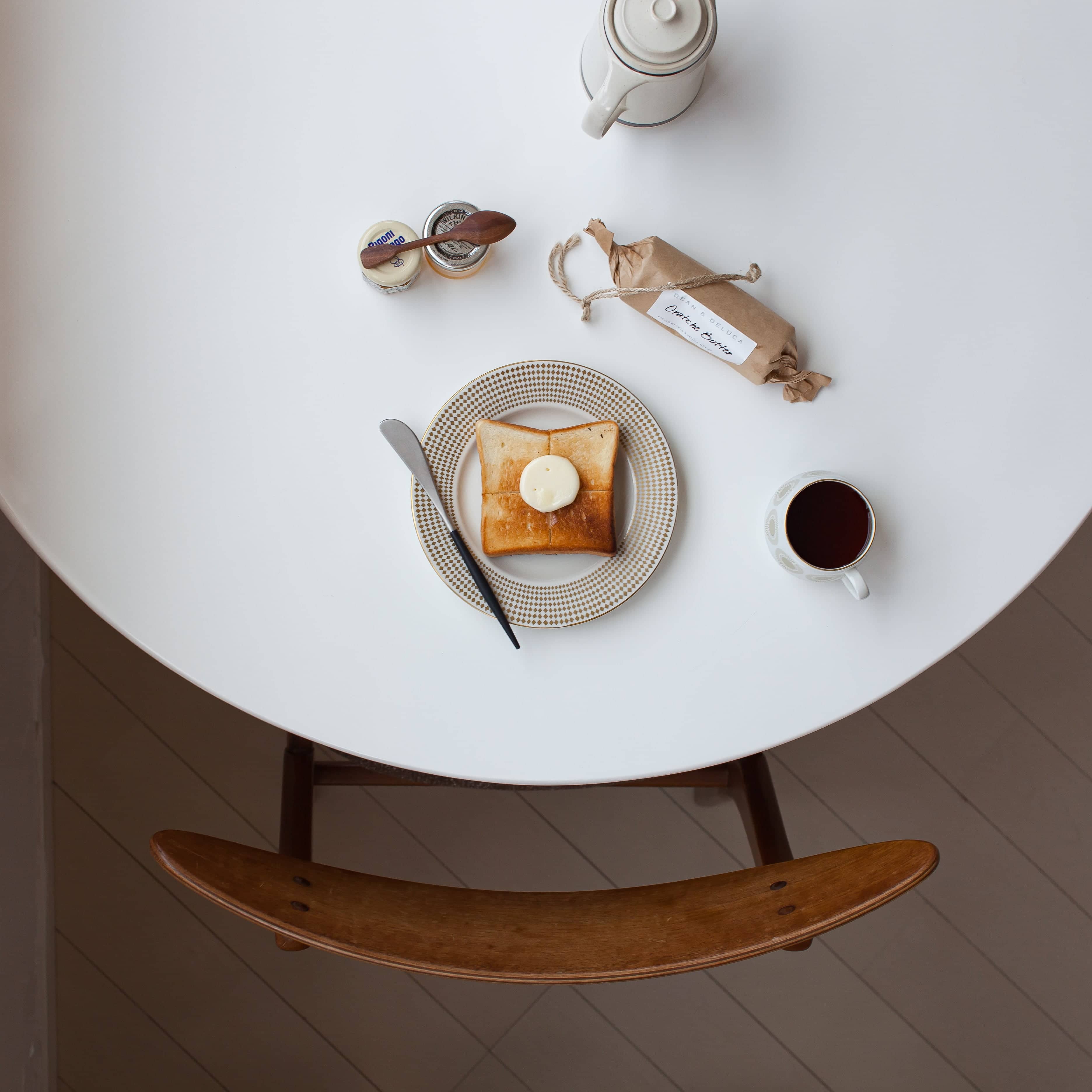
The above photo shows our dining table. It's a simple, minimalistic composition, literally letting white space abound. Some might find it sparse, preferring a busier table, but the presence of negative space actually enhances and highlights elements like toast and coffee.
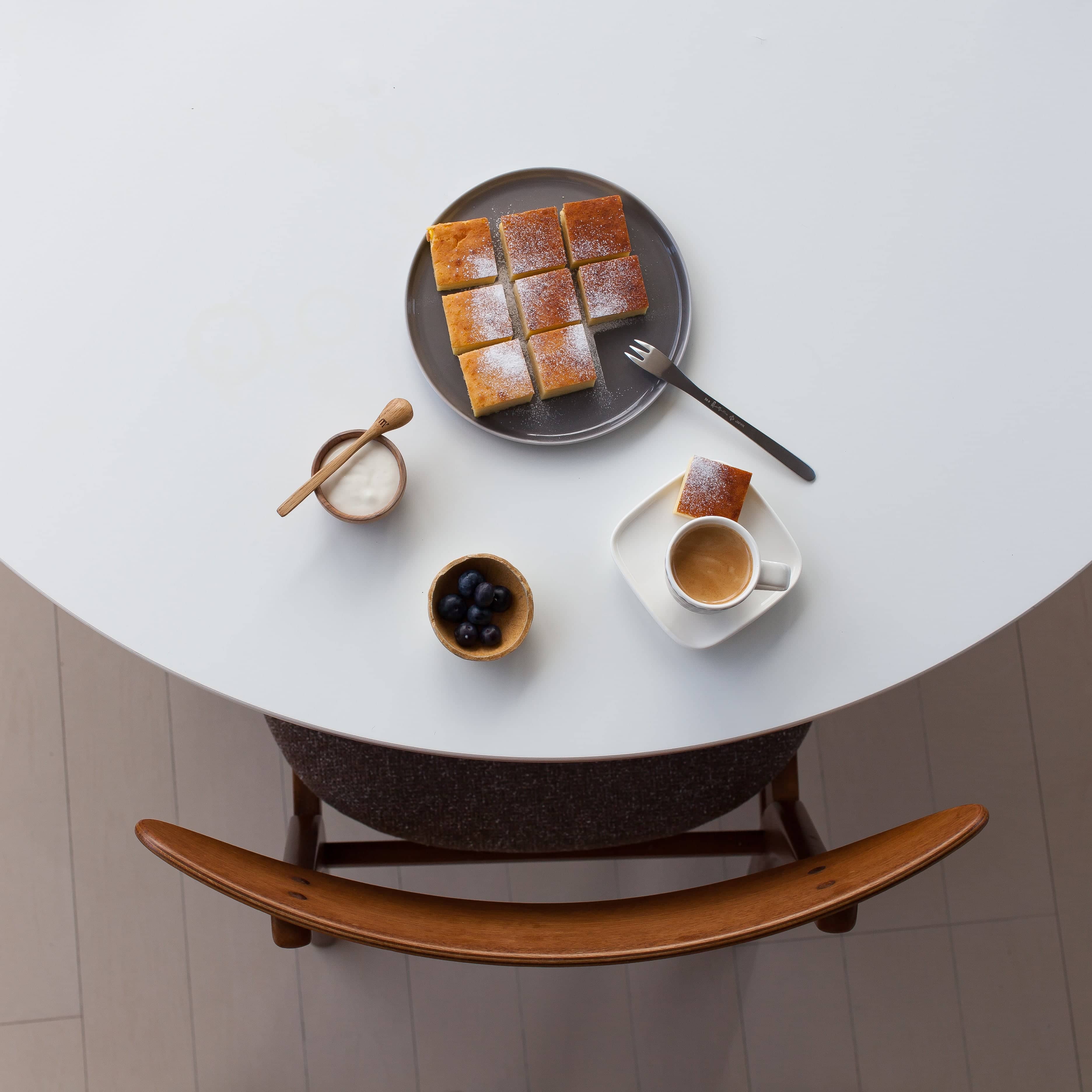 For an impressive presentation of cheesecake, the dishes are coordinated in monochrome, matching the table’s white, making the cheesecake and coffee stand out starkly on the saucer.
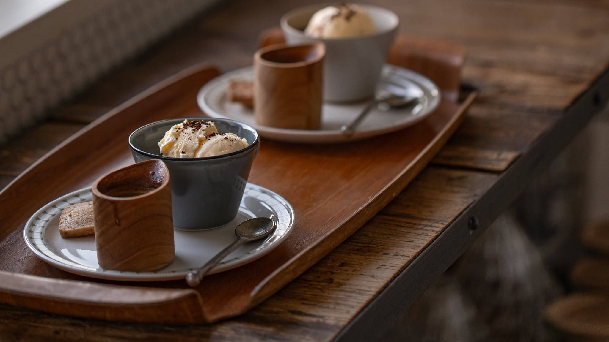
Grouping with a Tray
In the previous images, we arranged cutlery and dishes as if creating a collage. In this chapter, we introduce simple table coordination ideas using trays.
First up, an oval tray neatly containing a set of cakes and coffee for two, compacting the table layout while preserving ample negative space.
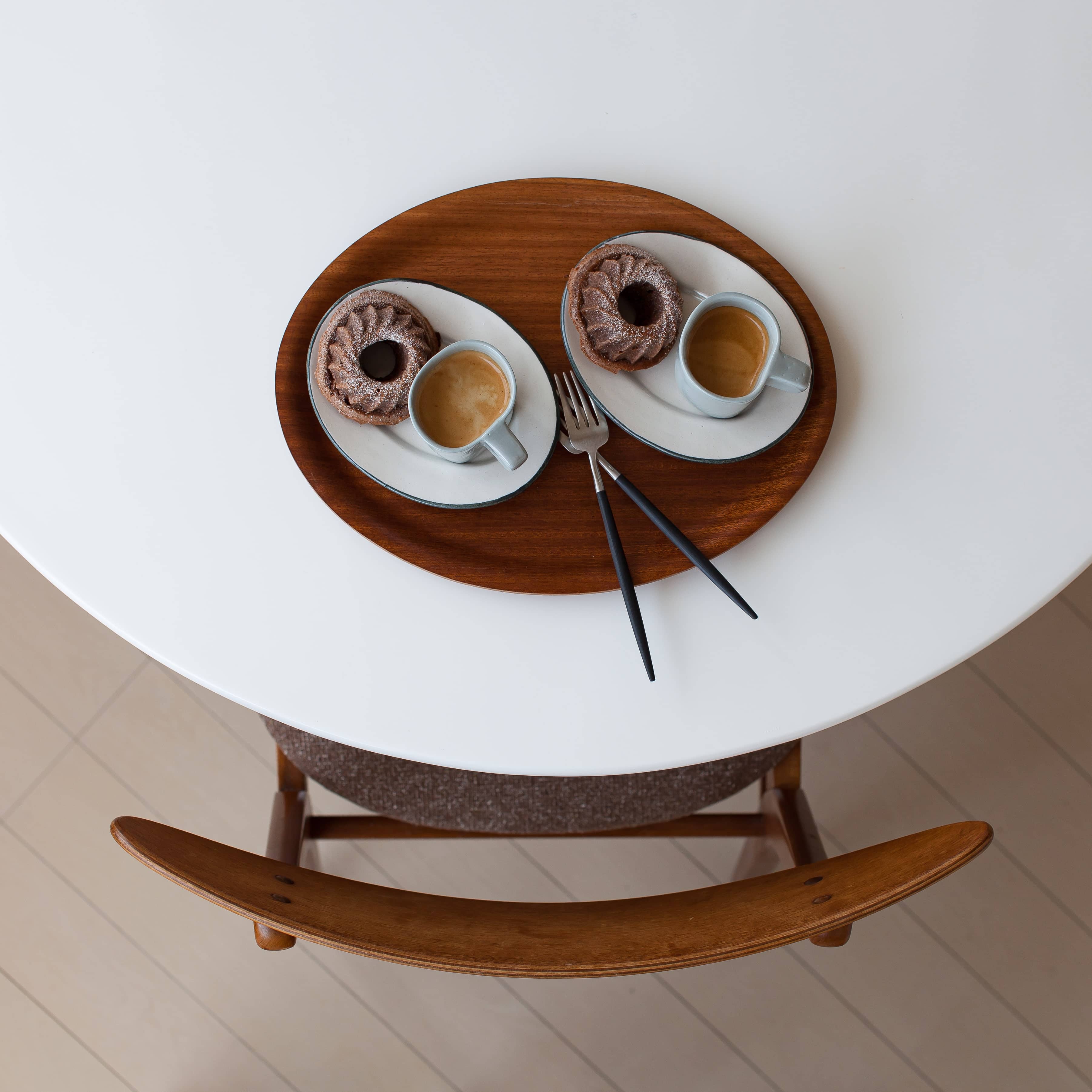 A set of pastries and espresso for a coffee break.
Changing the shape of the tray alters the impression of the photo. Since adopting the overhead angle, I realized how the presence of negative space draws the eye to the tray.
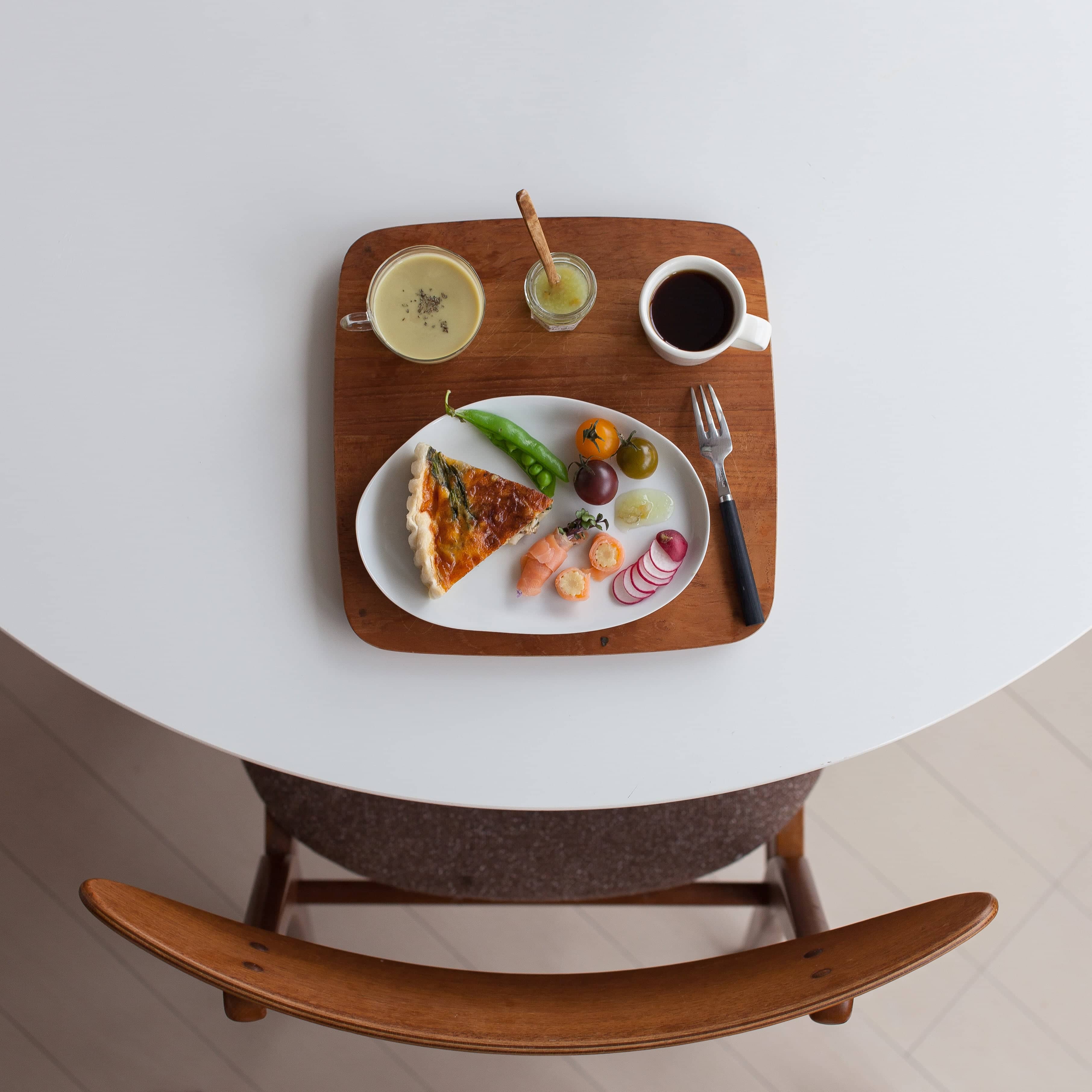 A set featuring quiche, marinated seasonal vegetables, and soup, with dishes selected to fit the tray’s shape.
Matching the shapes of trays and dishes creates a unified look across the plate. Here, a circular tray is paired with round dishes.
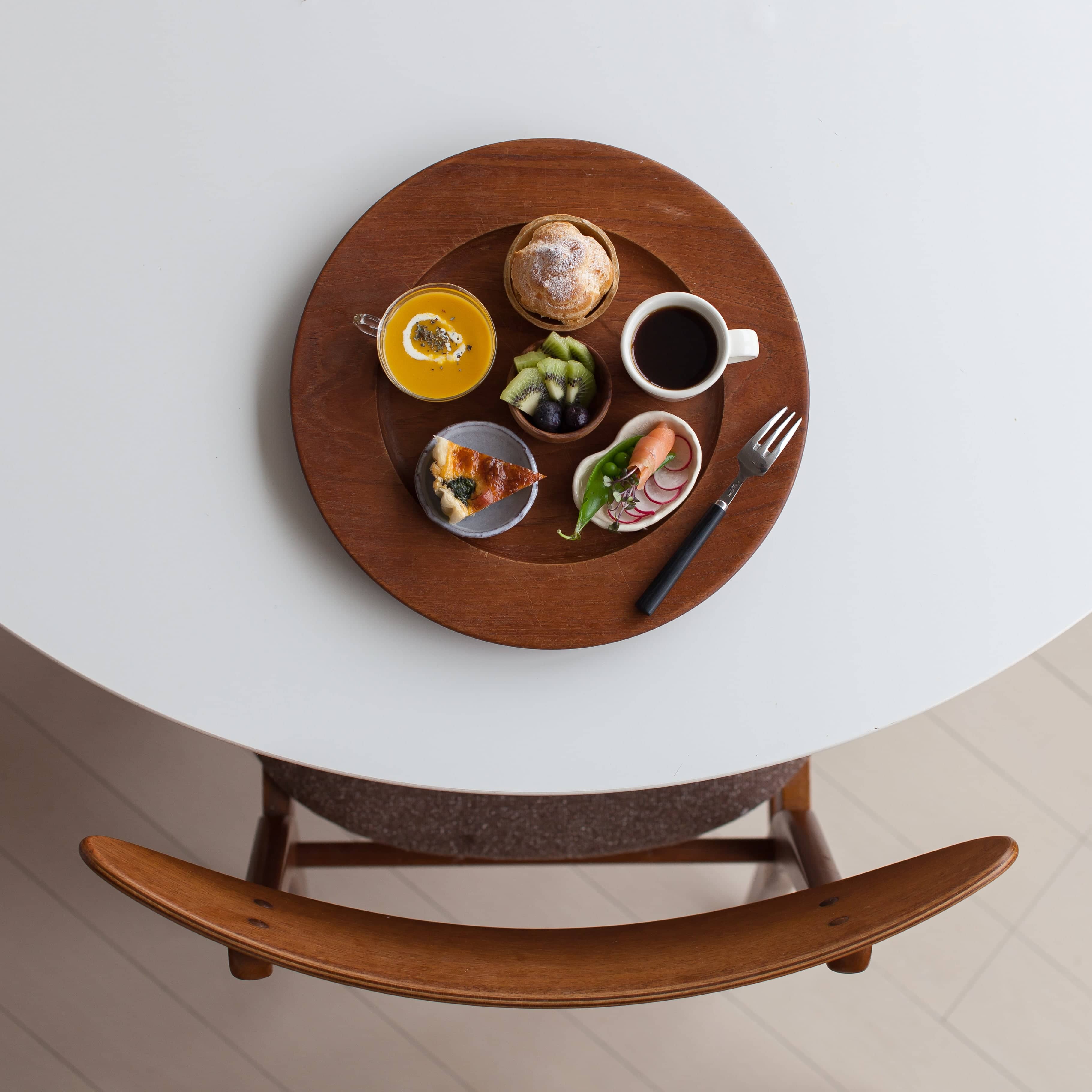 A plate with quiche, pumpkin soup, marinated vegetables, and mini choux pastries.
If you have a space with good natural light, consider moving your table there. The sunlight is another essential element in utilizing negative space. In the photo below, I adjusted the amount of light seeping through the blinds while shooting.
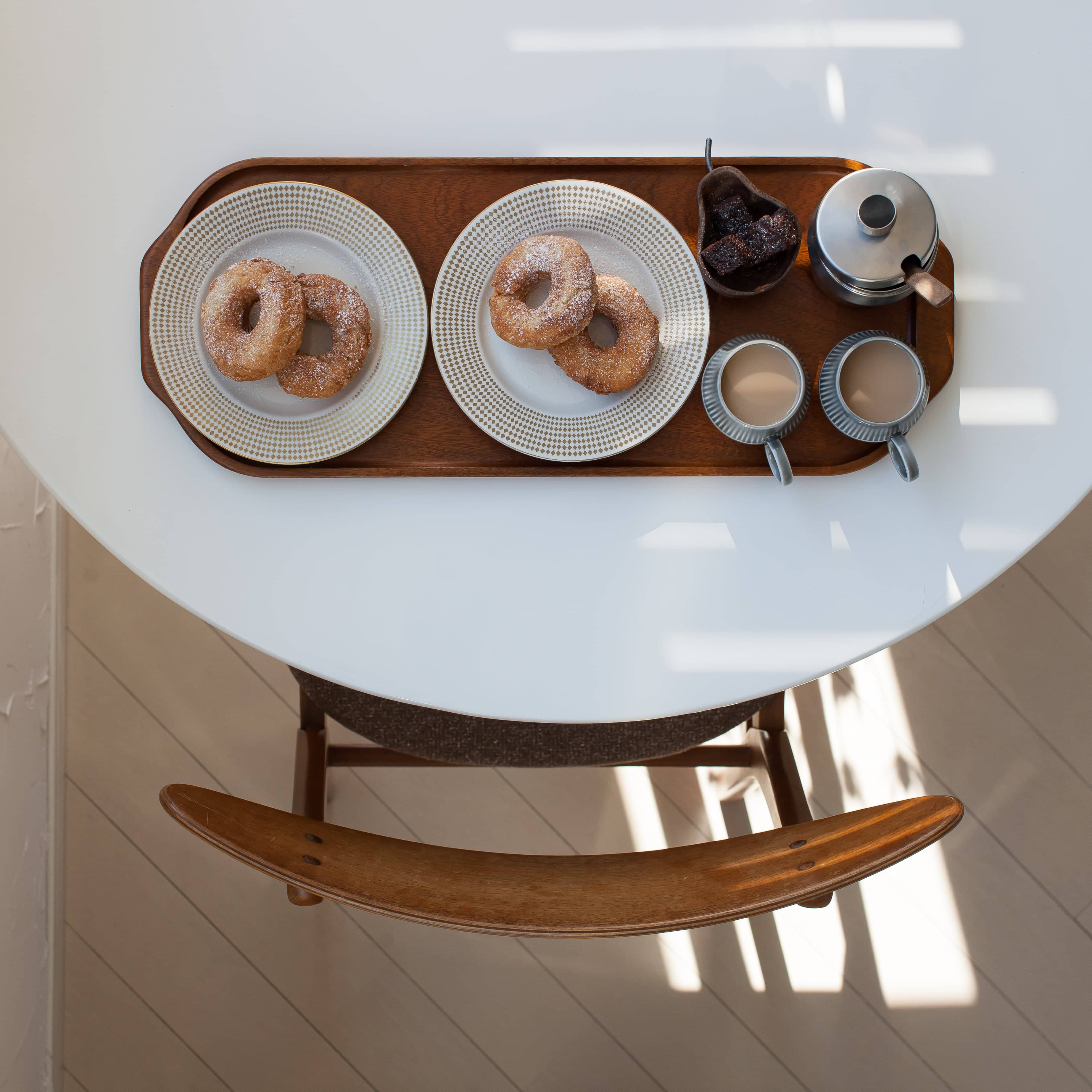 A tray with donuts and café au lait.
Employing Basic Composition Principles
Using classic composition principles, we also create negative space. Here, the subject’s center aligns with the intersection of the lower and left lines of a third-division grid, creating negative space in the top right.
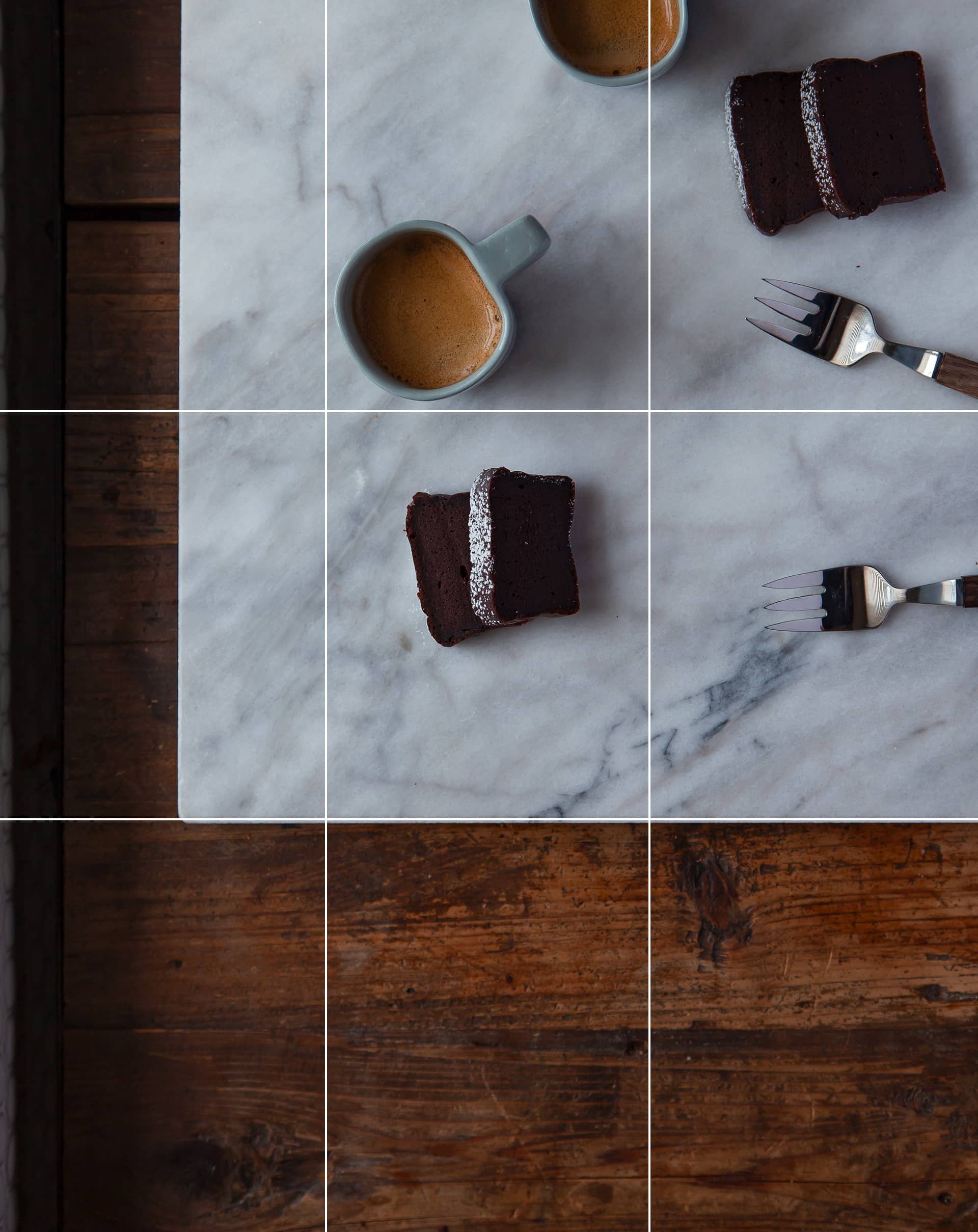
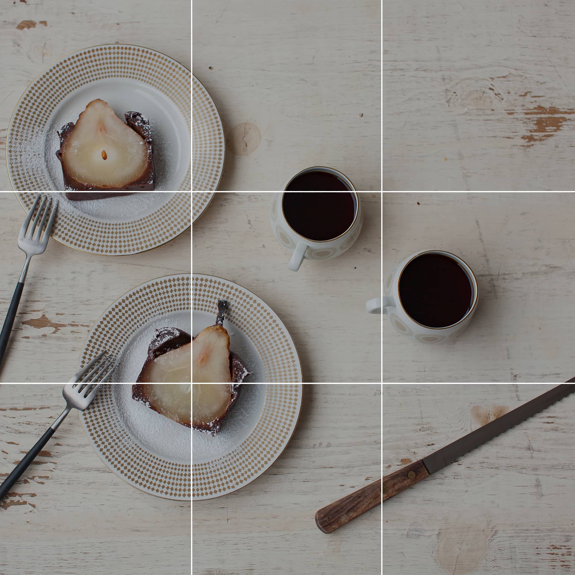 A pear cake and coffee.
The vertical 4:3 aspect ratio became popular initially on Pinterest, ideal for display on smartphones. This photo also uses the rule of thirds.
 Another vertical 4:3 aspect ratio photo, with corners carefully cropped.
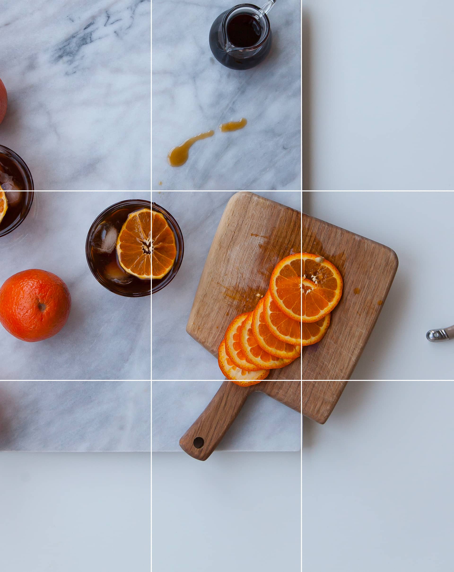 Iced coffee with orange and homemade coffee syrup. The handle of the knife used to cut the orange is visible on the right edge.
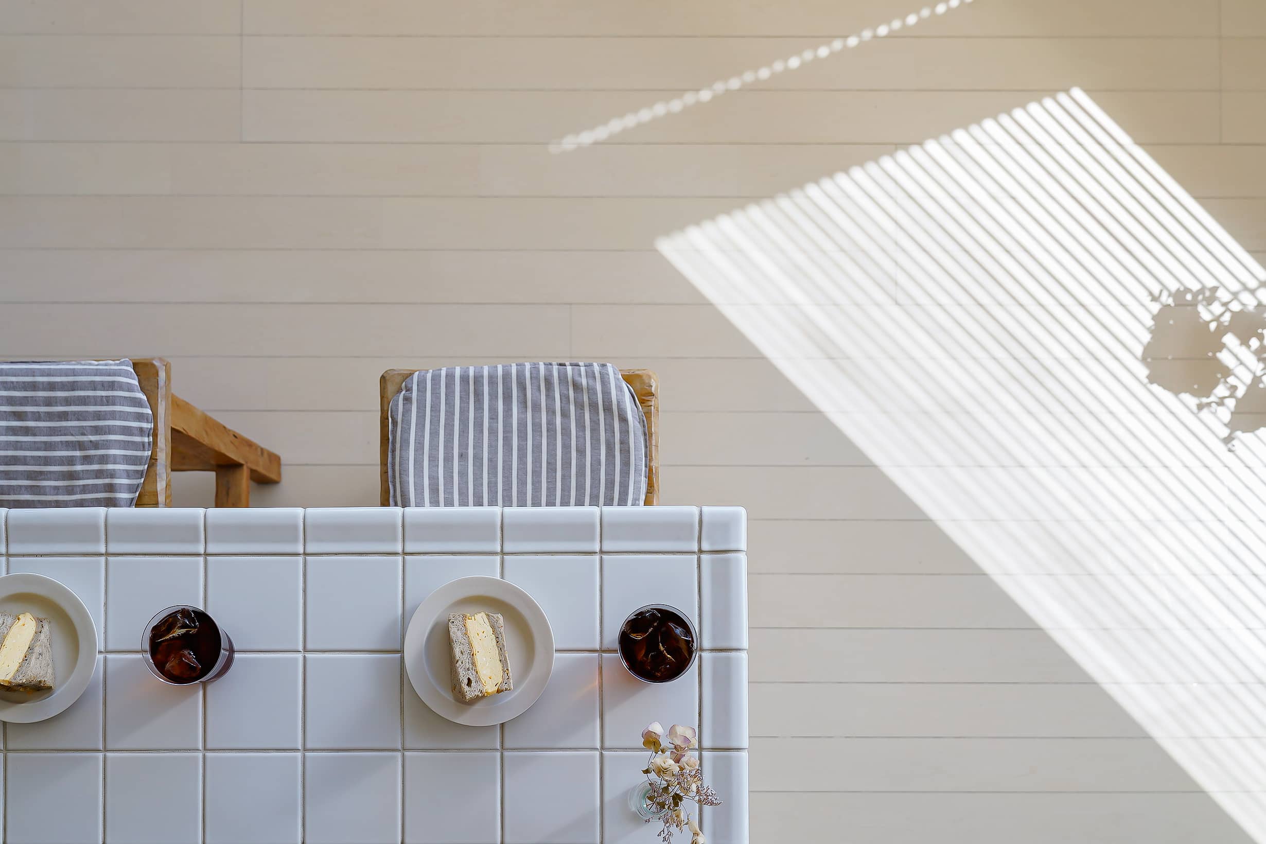
Utilizing Corners
Using the corners of tables or counters naturally creates negative space, offering an interesting composition unique to the overhead angle.
 Our home kitchen counter.
The contrast between the bright table and the darker floor is intentional, without seeming forced.
I hope you found these insights into using negative space engaging. Having once worked in web UI design, I often argued that "this space is a visual rest for the eyes." Business owners tend to want to fill every bit of space, but sometimes, resisting and explaining the importance of negative space is necessary. That’s why I often mention "negative space."
Thank you for joining me through this exploration.